-

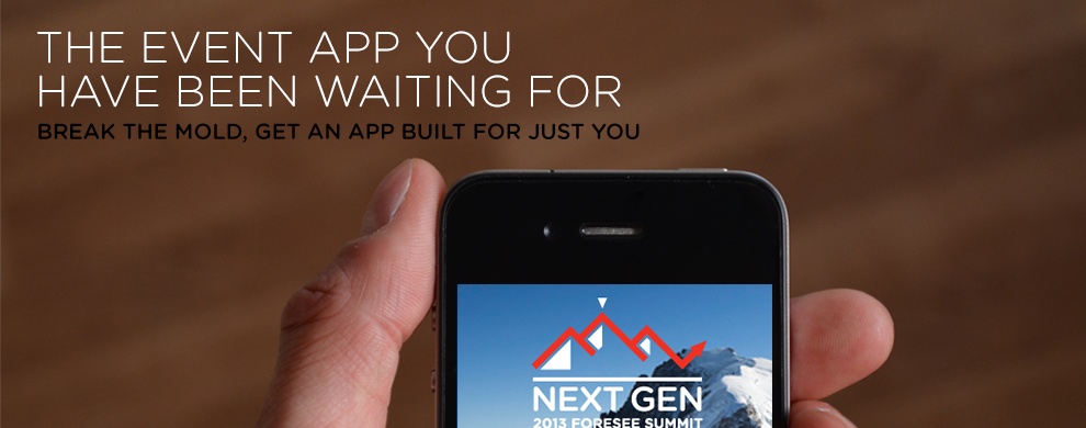
AWESOME EVENT APPS
We build customized, easy to use apps for events big and small. Learn how your meeting, tradeshow, conference or corporate event can take advantage today.
MORE -
 Check Out a Video of EventEdge in Action
-
NO CONNECTION, NO PROBLEM
Internet connection at events is spotty at best. We build our apps native for all the major platforms and sync all the data so our apps work regardless of connection.
-
EASY TO UPDATE AND TRACK
Our backend system makes it easy for organizers to update their information anytime, anywhere. Plus, get real-time feedback & analytics all in one place.
-
BEST SERVICE IN THE BUSINESS
We pride ourselves on bending over backwards for every client. We will guide you through the whole process, get you started and are on call 24/7 for whatever you need.
SETUP A DEMO TODAY

Easy to Get Started
Organizers don’t have extra time to spare so we make it easy to get up and running.
Simple Management
Manage all your data and push new information from an easy to use management platform.
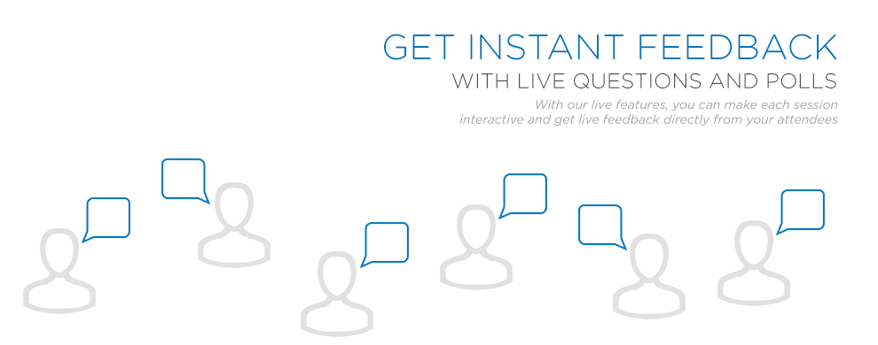
Instant Feedback
Keep your fingers on the pulse of your event with real time feedback and analytics.
Save Time & Money
Our apps simplify life for organizers while adding value for sponsors & saving money on printing
"We had nothing but rave reviews about the EventEdge app. All users were very satisfied and thought it was a great tool."
- Steve Gross, JFNA"Customer service was phenomenal. Do you guys sleep?"
- Melissa Bauman"Very good experience. Had compliments during the event on the app and would use them again and recommend them."
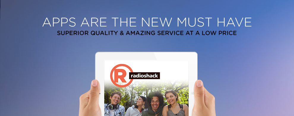
- Jason Kucera, RadioShack